Inspiration

Green Spot

Janice_mcdonald.greenspot
This is the collage that I ended up sending to the National Collage Society's Postcard / Small Works Show. Hard to capture in a photograph, but the area above the plant spiral is a piece of dull silver leaf.

It was great to hear that "Green Spot" has earned an award from juror Craig Lucas, Kent State University Emeritus Professor. The award-winning collages, all 4 x 6" format, are posted online here for your browsing pleasure. The show, consisting of about 140 pieces, continues through July 25th at the Mansfield Art Center in Mansfield, Ohio.

I especially like the look of Jaynie Crimmins' piece, "Explosion of Debt," and the thinking behind it. More detailed views of her highly textural collage and encaustic work are on her website.

Above: "Green Spot," 4 x 6," contemporary paper collage on watercolor paper. © 2010, Janice McDonald.
Christo's "Over the River" project in Colorado

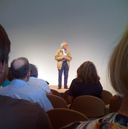
Christolecture
I had the good fortune to attend a lecture by Christo on Wednesday. He was discussing his proposed "Over the River" project to be sited in Colorado's Arkansas River Valley in 2013, hopefully. His visual record of previous projects and stories were wonderful. A series of collages, hand done, that he has produced to show the effect of the fabric covering portions of the river, were stunning. Sales of these preliminary works completely fund the eventual installation.

The amount of work that is done to research potential site(s), get permits, test materials, assure engineering success, and win environmental and/or community approval is simply amazing.

He talked about his use of fabrics and how we usually can only feel the wind, but once the fabric is incorporated into his projects, we can also see the wind. Another part of his work that he stressed was the importance of scale and the relationship of the viewer to the work, most recently evidenced in photos of The Gates installation in New York City.

I was struck by Christo's incredible tenacity, energy level, and ability to discuss his work in simple terms. It takes years for his projects to come to fruition and then they are so ephemeral. He described his art as "creating gentle disturbances for a few days." I wish I'd written down more of what he'd said!

I came away thinking that it would be great to see the installation from above and perhaps even more interesting to see it from below, on a raft! (A Denver Post article takes a more objective view.)

Wabi-Sabi art show at Sync Gallery

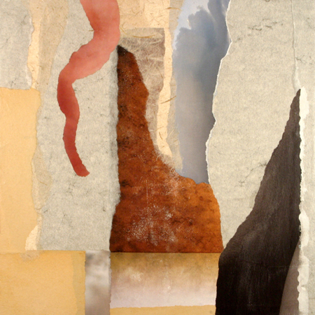
Janice_mcdonald.formations
I'm happy to have one of my collages juried into the show, Wabi-Sabi: art of imperfection, at Sync Gallery. Juror was Michael Gadlin. I was out of town when the show opened last Friday and can't wait to go visit. The exhibition is on view through July 10th. Sync Gallery is at 878-1 Santa Fe Drive in Denver.

My piece (above) is "Formations," a collage composed of contemporary papers on wood panel, measuring 12 x 12 x 1" (with frame, not shown, it's approximately 14 x 14 x 1"). This collage was definitely influenced by my hiking in Colorado and Utah. 

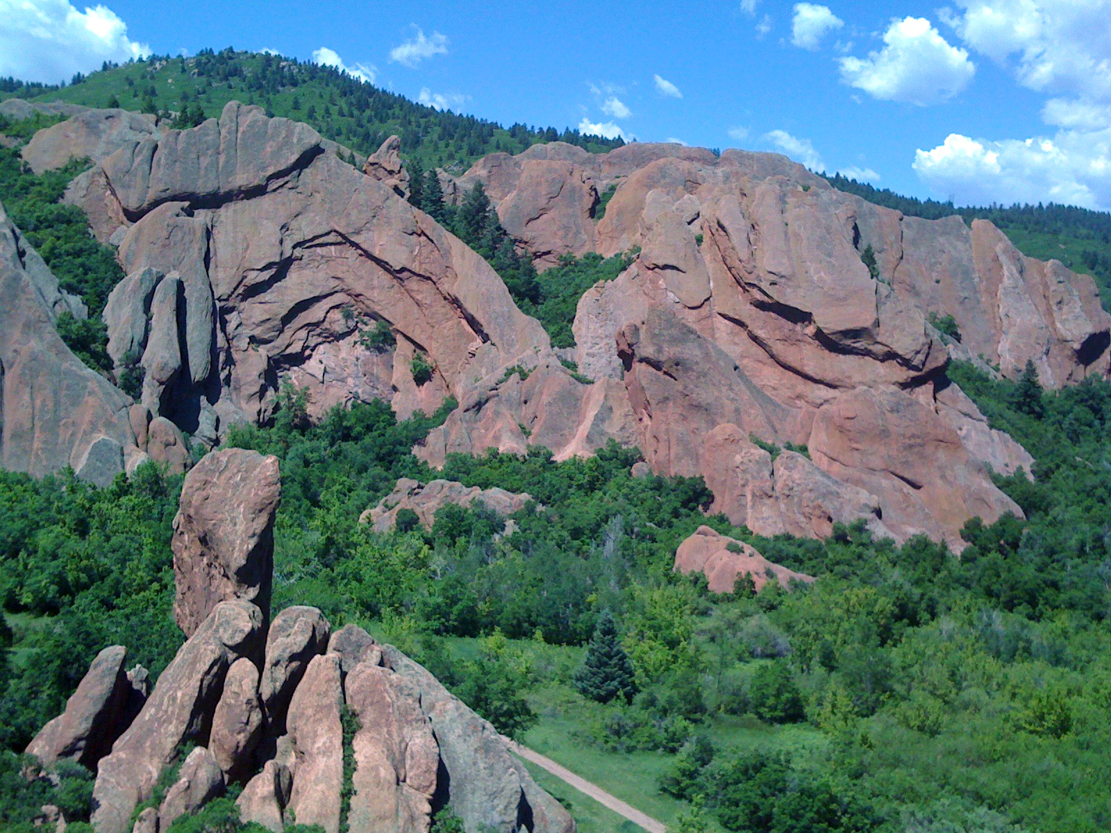
Posted below is an image taken earlier this month while hiking at Roxborough State Park. I love the monumental qualities of huge rock formations and the way they change as the light moves across them over the course of the day. (To get a sense of scale in this photo, the straight line at bottom is a trail about 9 feet wide.)

For more on Wabi-Sabi aesthetics, check out this article on Learning to See the Invisible.

Rockformations
 

Art & design, musing no. 1

Art & design, musing no. 1 

I've been thinking a lot about my efforts to balance emerging art/collage interests with my long-established design practice. There have been times when I felt I could walk away from design and focus completely on collage. Then I have moments, like today, when I'm mulling over how to visually re-position a business and can't imagine not having that interaction and challenge in my life. 

I'll always think like a designer. It informs everything I do. It certainly contributes significantly to who I am as an artist. 

Balance could be wildly over-rated. Heading full-tilt in the direction of what I'm most interested in at the moment may be the best approach. One creative endeavor feeds the other. At this time of hybridization and collaboration, perhaps a renaissance approach suits me best. 

And then there's the overlap. Many of my design clients also collect my artwork, while many of my artist friends ask for design advice. My card says artist/designer. Maybe it should say artist+designer... It's all connected. 

(Photo is a pattern of light through moving tree branches, cast across a wall, just another random but visually intriguing moment in my day!)