Design

Uprooted & installed again: collage commission 6

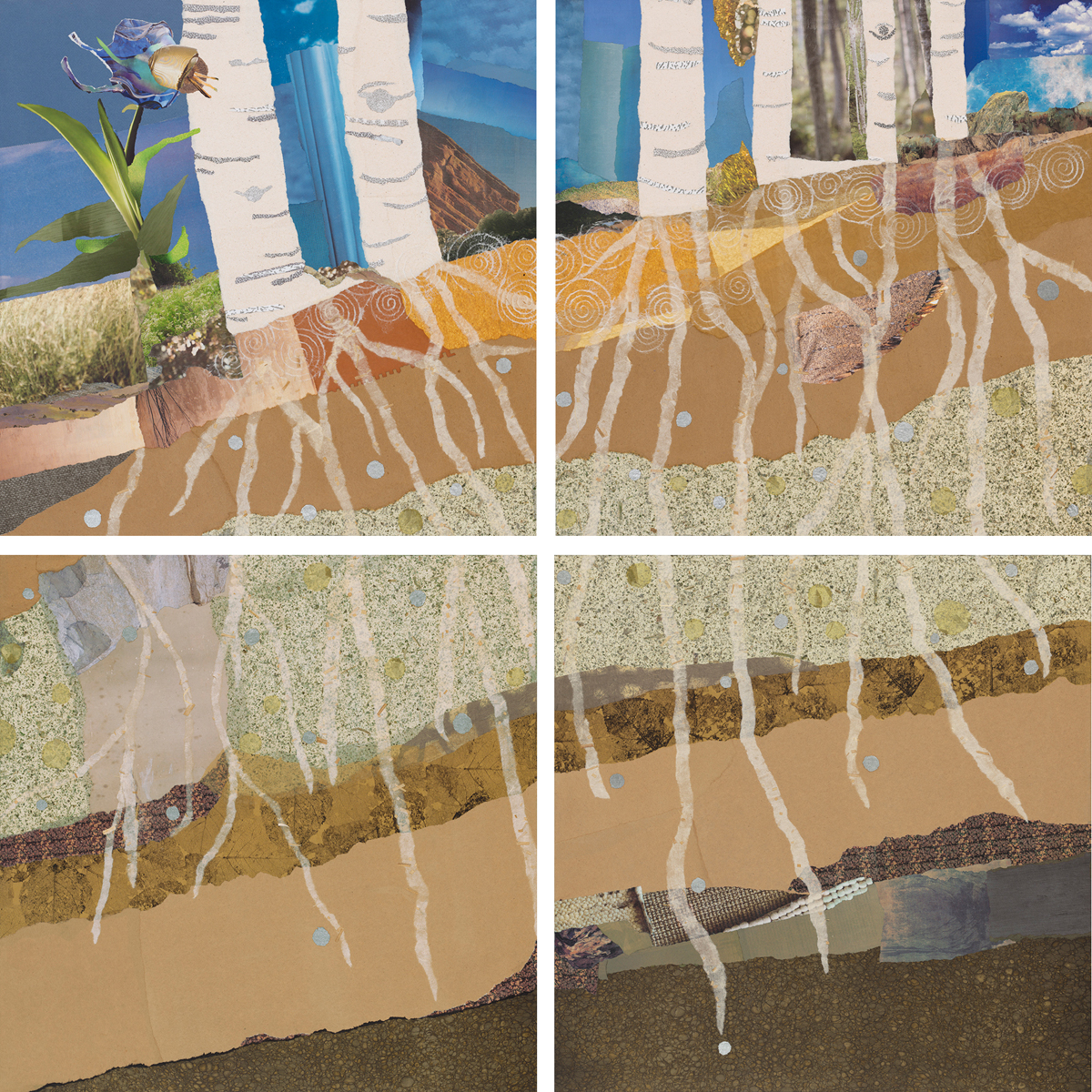
rootedtogether.overview             Well, the decision was made to uproot "Rooted Together" and move the collage to the adjacent wood-paneled wall. The wood frames it nicely but I wish the metallic lines didn't intersect the piece. If I had known it was going to be placed there, I would have made the collage as one piece, rather than on four panels.Most people will never know it wasn't intended to go there though. And the client is the ultimate "decider." Hopefully many people, strolling by, will enjoy it. This location does allow people to approach the collage more closely for a look at the details."Rooted Together," close up on modular wooden wall.

Finished and installed: collage commission 5

"Rooted Together," original collage by Janice McDonald                The art consultants, Noyes Art Designs, have hung the collage in the surgical waiting room as planned. Unbeknownst to them, outlets for a flat screen television were installed late in the process and the area is now compressed. I'm not happy with how it looks — the lines of the white tree trunks are confused by the adjacent white boxes.  RToriginallocation_7441Still, people seeing the work for the first time at the grand opening tell me they were drawn into the work and didn't even notice.Over 7000 people attend the grand opening and most all the commissioned artists were there to discuss their work, including me. What a beautiful hospital. The views of the mountains are stunning.There is talk of adding another television, to the two already in the room, and moving the collage to the wood-covered wall about ten feet away (you can see a bit of it at right in photo). It seems that there will not be even one area of the waiting room where someone can get away from the visual stimulation of 24-hour news coverage! The wood wall also has a grid of silver detailing which I think may not relate well to the grid structure of the collage panels... But we'll see.

Final touches: collage commission 4

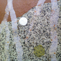
Adding the root structure and bridging the pattern across panels.Getting the roots to align well from one panel to another was challenging. They needed to intertwine and anchor the composition. Each root was put down separately so the process was additive. I ripped lots of curving pieces (many of which were rejected) before I got the look I wanted.I also added ripped rounds of rice paper and a metallic silver paper to punctuate the roots and symbolize the energy of nutrients and water droplets. The placement of each little element was carefully considered, piece after piece. The metallic paper adds just a bit of sparkle but is hard to photograph, appearing whiter than it looks in person.Root detail with applied circles of metallic and rice papers.Once I thought that I was close-to-done, I still didn't have an adequate place to hang the four pieces together. So they were evaluated in this carefully stacked position multiple times as I tweaked details.Eventually, they were deemed finished and received multiple coats of protective varnish before being carefully wrapped for delivery.Collage panels stacked in the studio.