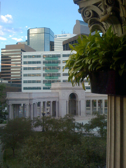
 I've thoroughly enjoyed dipping in and out of events related to Denver's Biennial of the Americas over the last month. I didn't make it to the more heavily promoted Roundtable speaker series, but have focused my attentions on the art happenings around town.
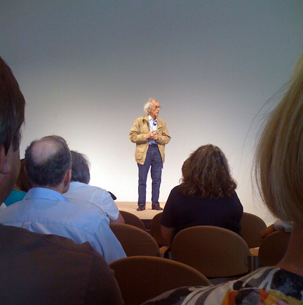
"The Nature of Things" exhibition at the renovated McNichols Building is quite wonderful. Westword's Michael Paglia has written a comprehensive review of the artwork there and elsewhere. I've been to several really good talks as part of the speaker series there too.
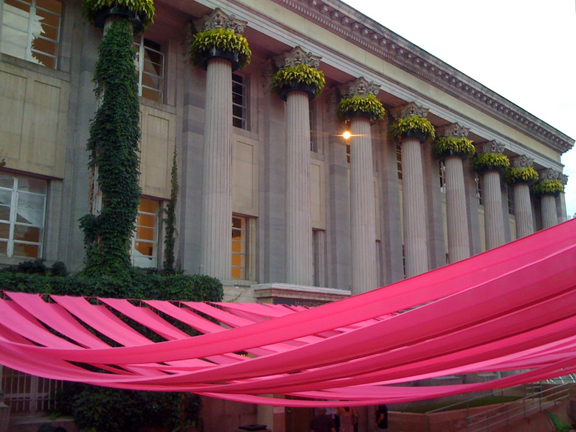
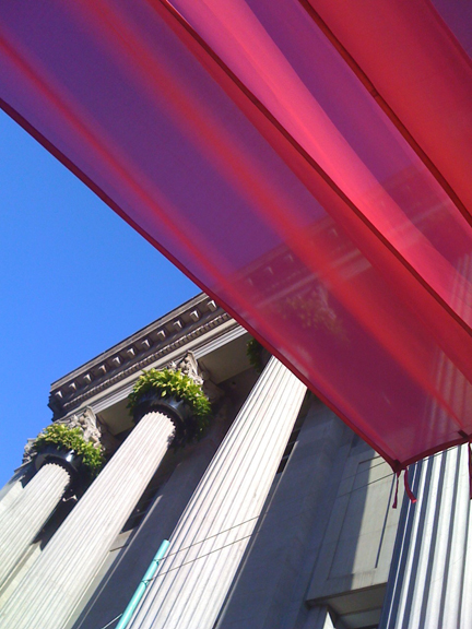
I love the whimsical transformation of the outdoor space by Jeronimo Hagerman (see above). Adding the vegetation to the capitals on the building is intriguing from the exterior but also refreshing and engaging when glimpsed from the windows on the third floor of the exhibition. I just wish the McNichols exhibition and talks had been free throughout the Biennial, rather than just during the last week -- I think they would have been so much better attended and as a result provoked much more consideration and discussion.
Civic Center Park looks fabulous. The gardens are amazing this year with creative plant combinations that compel me to pull out my camera again and again.
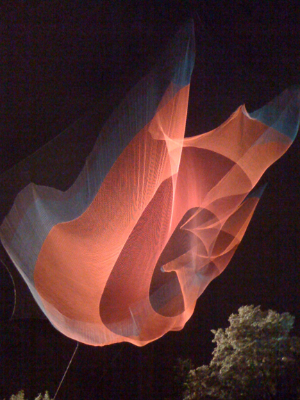
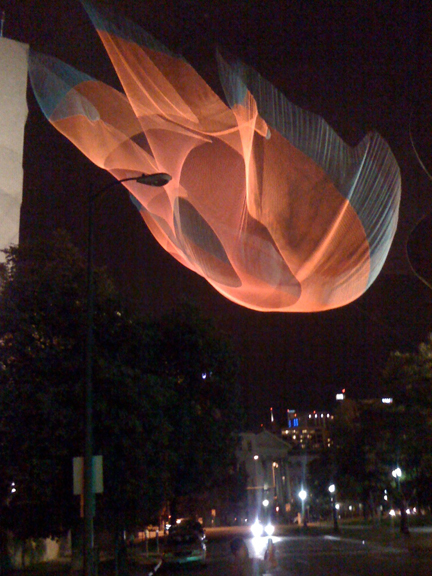 My favorite Biennial work is the temporary public piece, "1.26," suspended over the street between the Denver Art Museum and Civic Center Park. Janet Echelman has created a netted aerial work that is vaguely interesting by day but phenomenal when viewed at night. My photos don't do it justice so if you are in the area, try to get down to see it some evening soon. (Or see better photos on the artist's website via link above.) The work was inspired by a simulation of the February 2010 Chilean earthquake and speaks to the "temporality and interconnectedness surrounding the 1.26 microsecond shortening of the day that resulted from the redistribution of the earth's mass." Most of the people looking at it last night seemed to think it looked like a jellyfish or a butterfly, but from certain vantage points it has both ethereal and explosive qualities. Truly wonderful.
